A branding proposal to my hometown.
Background
Batloun is a small Lebanese village located in Mt. Lebanon. With no particular main attractions, it is much less known than its neighboring villages of the Shouf area.
Batloun is a small Lebanese village located in Mt. Lebanon. With no particular main attractions, it is much less known than its neighboring villages of the Shouf area.
Challenge
Introduce location branding to Batloun and place it on the touristic map of Lebanon.
Create a brand the reflects the history and authenticity of Batloun as a traditional Lebanese village and still appeal to the younger generations and new visitors.
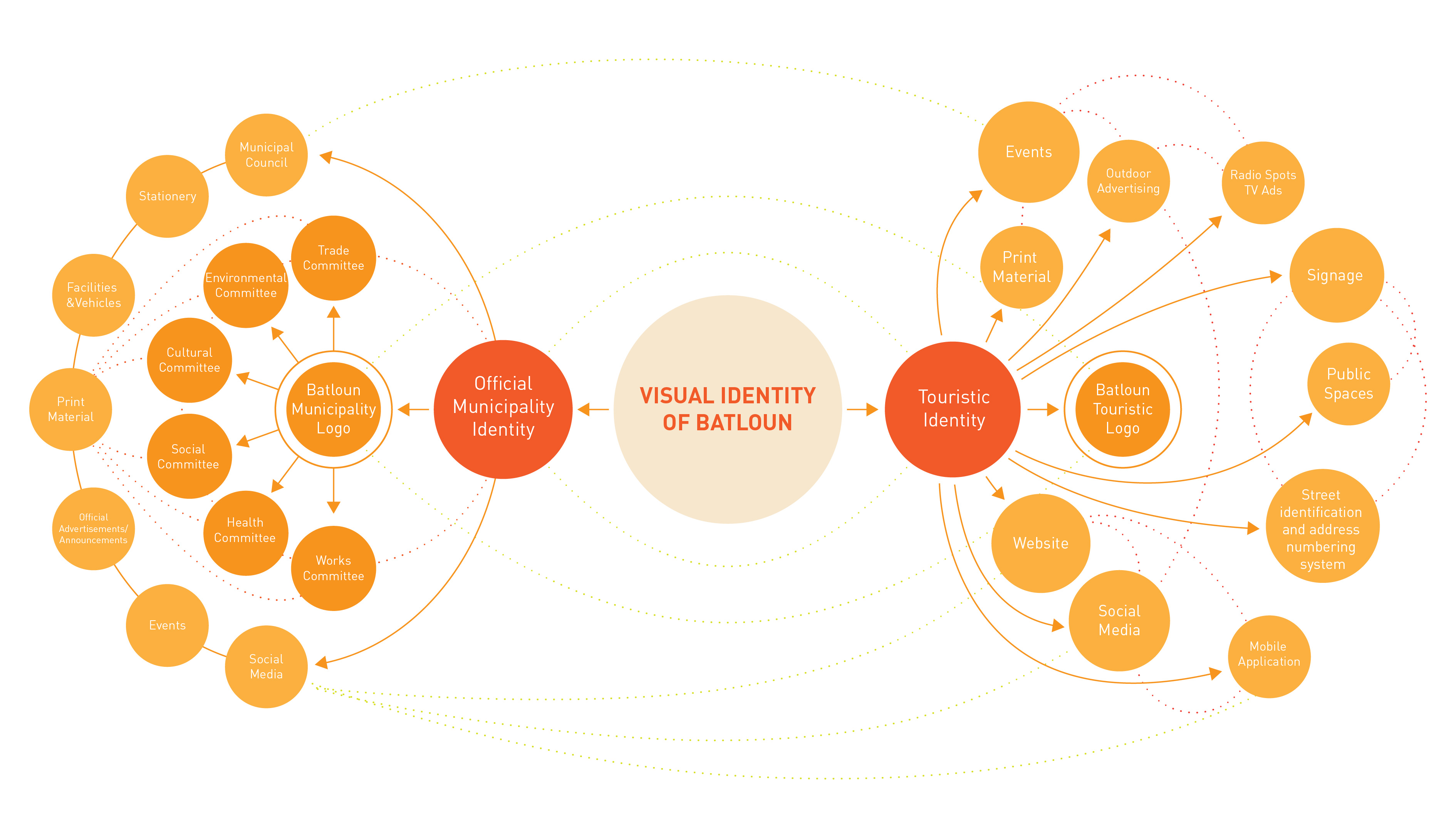
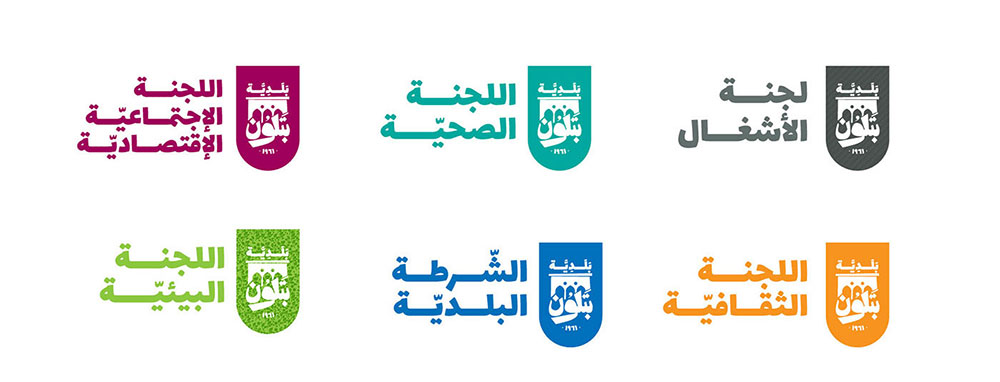
Reflect an image the inhabitants can adopt, relate to, and be proud of. In addition to that, the branding aims to set a clear visual communication system that unifies the touristic image and the official one of the municipality with all its committees under one unique and recognizable identity.
Introduce location branding to Batloun and place it on the touristic map of Lebanon.
Create a brand the reflects the history and authenticity of Batloun as a traditional Lebanese village and still appeal to the younger generations and new visitors.
Reflect an image the inhabitants can adopt, relate to, and be proud of. In addition to that, the branding aims to set a clear visual communication system that unifies the touristic image and the official one of the municipality with all its committees under one unique and recognizable identity.

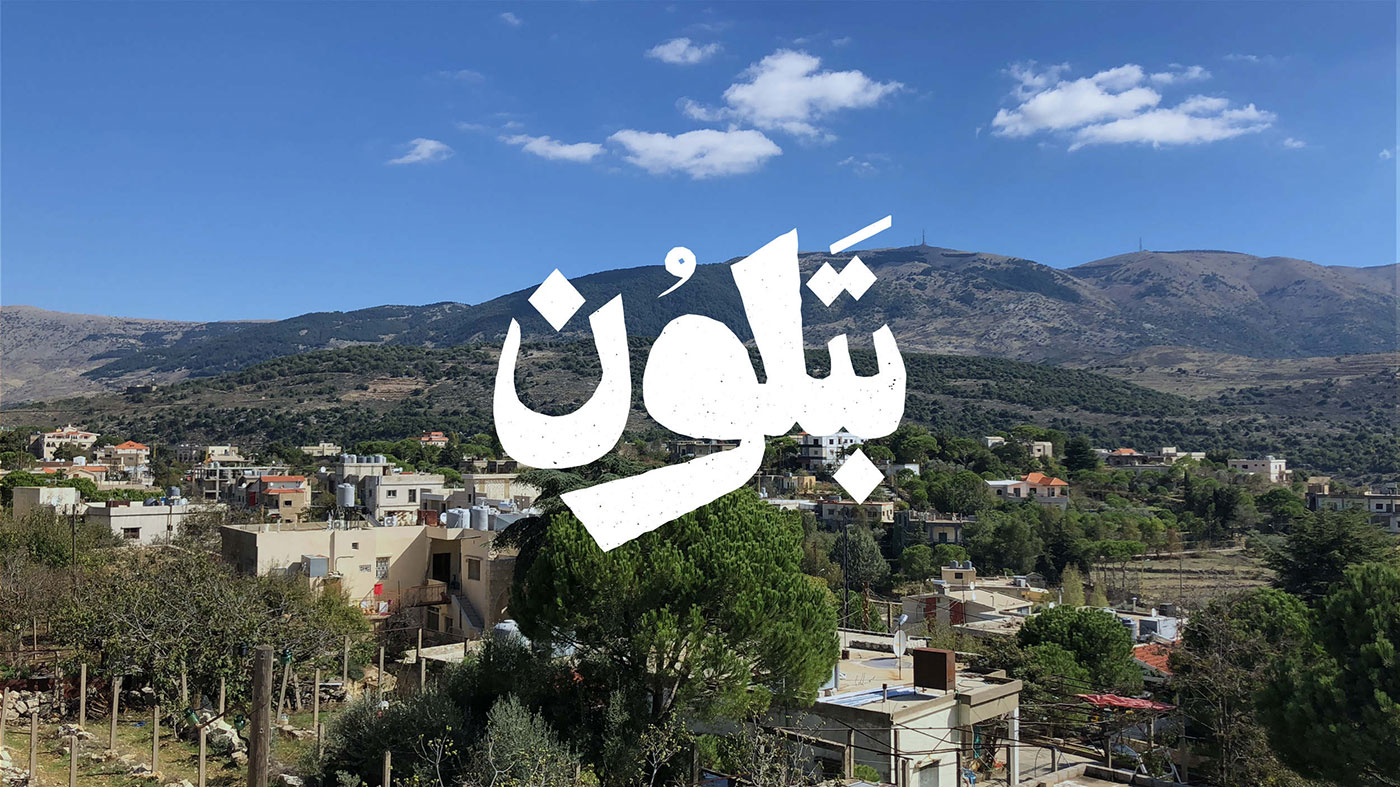
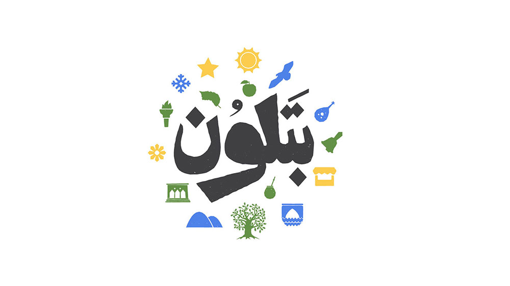
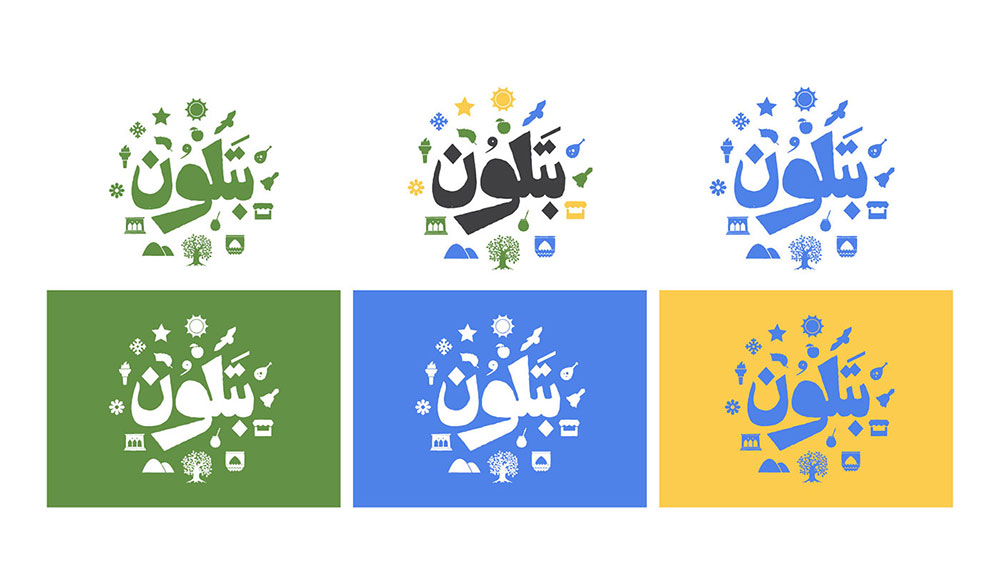
Logotype
The Arabic logotype is designed to have maximum legibility. The classic Naskh-inspired-letter shapes, stylized with rough edges and sharp extremities resembling the stone texture of traditional Lebanese houses, and the stone walls all over town.
The Arabic logotype is designed to have maximum legibility. The classic Naskh-inspired-letter shapes, stylized with rough edges and sharp extremities resembling the stone texture of traditional Lebanese houses, and the stone walls all over town.

Icons
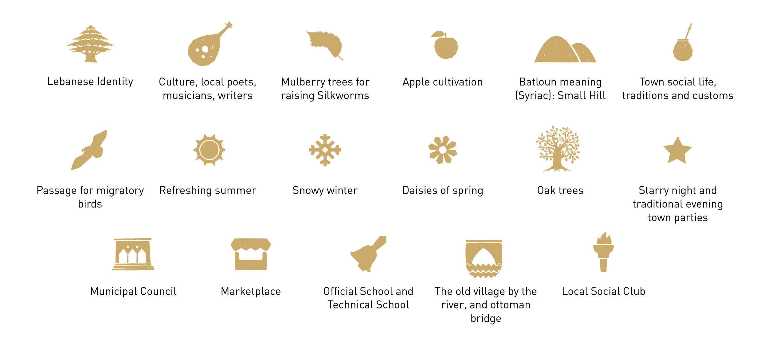
With research done about the history of the village, some conversations with older people, and a lot of personal experience as a resident, it was easier to determine the main characteristics of the town and what would qualify as the attractions of the village, and translate them to unique and stylized icons.
With research done about the history of the village, some conversations with older people, and a lot of personal experience as a resident, it was easier to determine the main characteristics of the town and what would qualify as the attractions of the village, and translate them to unique and stylized icons.
TOURISTIC LOGO

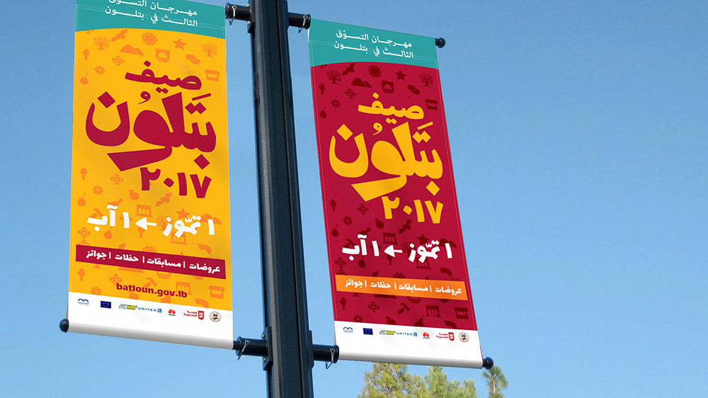
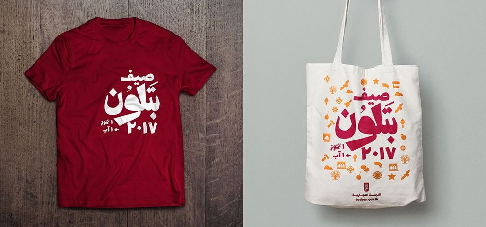
EXAMPLE EVENT BRANDING


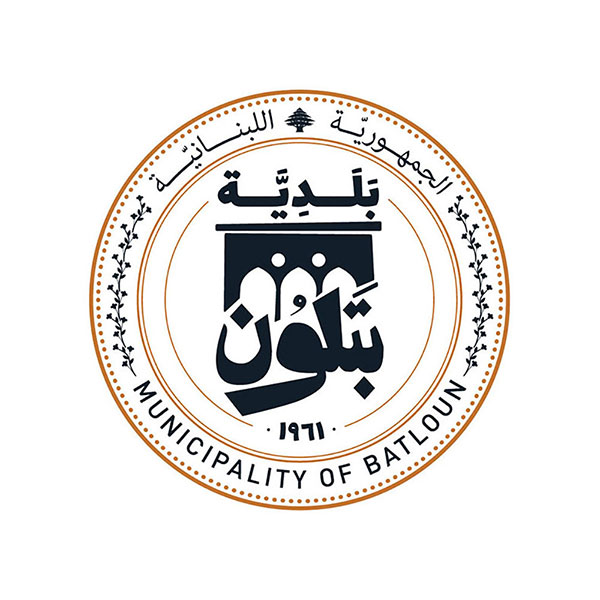
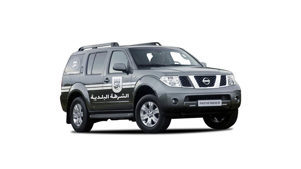
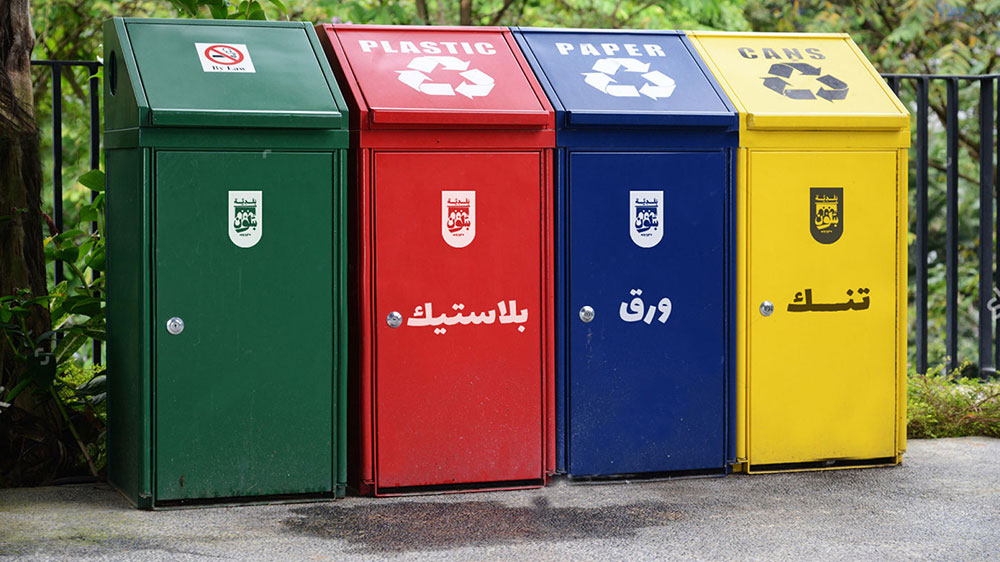
MUNICIPALITY LOGO


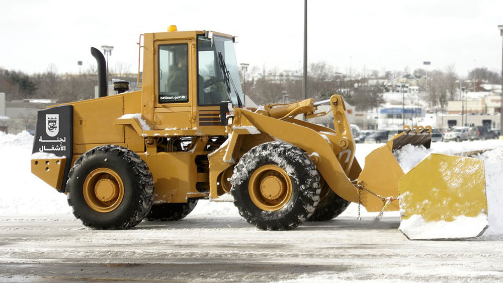
MUNICIPAL COMMITTEES LOGOS


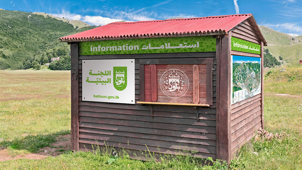
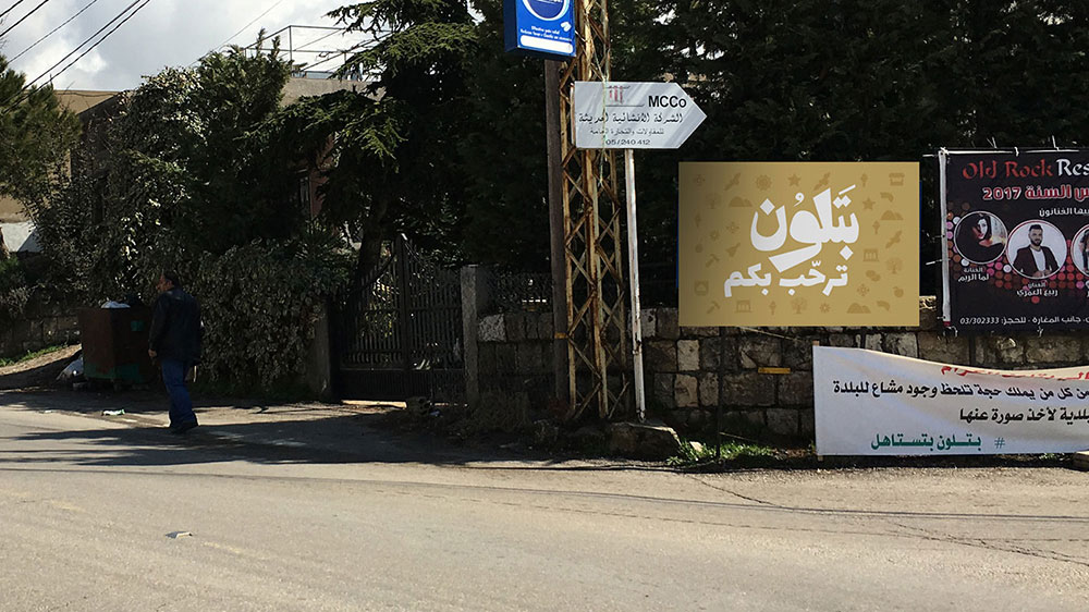
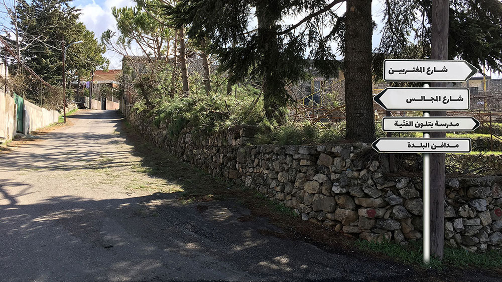
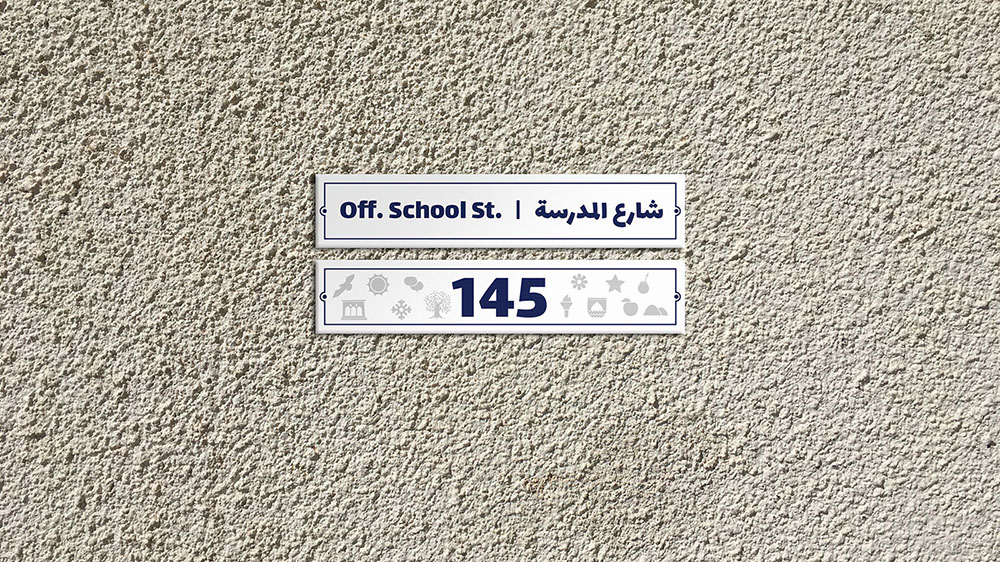
SIGNAGE & WAYFINDING